HTML form input types and best practices
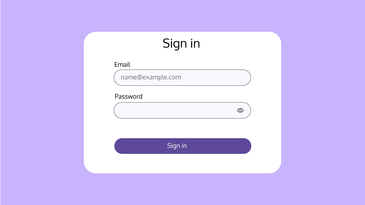
HTML forms are the first way of interacting with a website for users with which they can enter their data from filling out personal information to uploading files and entering payment details during checkout. The HTML forms have their specific input types that specify the types of data collection, help users fill out form fields, and validate the entered data accuracy. Therefore, it is essential to know each form type in detail, so that you can use them correctly.
In this article, you will read about:
1. Text input
<input type=”text”> is used for entering single-line texts such as first and last name.
<label>First name</label>
<input type="text" id="name" name="name" autocomplete="name" placeholder="Brenda">HTML example of a text input
2. Email input
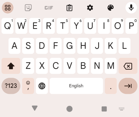
<input type=”email”> is used for entering an email address. This type also validates whether the entered email address is in the right format or not.
<label for="email">Email</label>
<input type="email" id="email" name="email" autocomplete="email" placeholder="[email protected]">HTML example of an email input
3. Website URL input
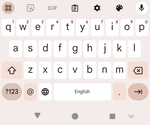
<input type=”url”> is used for entering URLs in the form. It validates and formats entered URLs.
<label for="url">Website URL</label>
<input type="url" id="url" name="url" autocomplete="off" placeholder="https://example.com">HTML example of a URL input
4. Password input
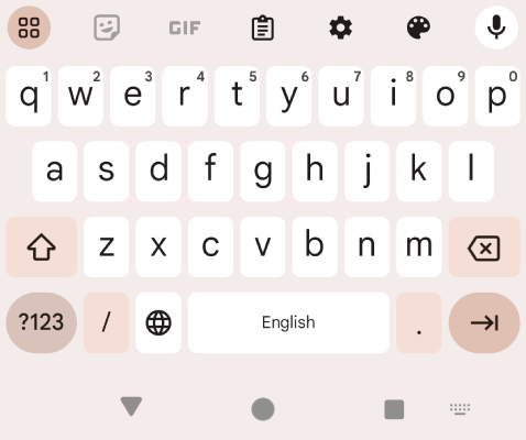
<input type=”password”> is almost similar to the type=”text”, but it hides the entered text in the field.
<label for="password">Password</label>
<input type="password" id="password" name="password" pattern="^(?=.*[A-Za-z])(?=.*\d)(?=.*[@$!%*#?&])[A-Za-z\d@$!%*#?&]{8,}$" autocomplete="off">HTML example of a password input
Here are some password best practices that you need to consider when designing a sign in or sign up form:
Password input best practices
Passwords are sensitive information that should be protected and safeguarded against every possible cyberattack and unauthorized access. Here are the most important actions that should be taken if there is (are) form(s) on your website where users have to create an account or sign in to their accounts.
Use password managers to suggest and save passwords
Using built-in browsers or third-party password managers that help choosing a strong password by suggesting passwords and also saving entered passwords to facilitate logging into accounts without the need to memorize hard passwords to enter them every time.
<input type="password" id="new-password" name="new-password" pattern="(?=.*\d)(?=.*[A-Za-z]).{8,}" required autocomplete="new-password" placeholder="New Password" aria-autocomplete="list">Ensure the password’s strength
By using password managers, users can choose automatically generated strong passwords. This increases the passwords’ security by decreasing the likelihood of choosing easy-to-remember passwords by users. However, many users prefer entering their own passwords, so it is necessary to implement some rules for setting passwords like the force of using symbols, capital or small letters, and numbers.
Allow password pasting
There are some websites that do not allow users to paste their passwords in the password field. This prohibition makes users choose simpler and memorable passwords which may result in the easy password selection and the increase of the compromised passwords. In addition, users only become aware that they are not allowed to paste passwords after they try one time to paste it, so not allowing to paste password does not prevent the clipboard risks.
Simple password change or reset
It is important to provide users simple and easy-to-access password reset and change. Users should be able to easily access password change or reset pages, so it is needed to help users change their passwords for any reasons including in-danger password security. One of the recommended solutions is to redirect /.well-known/change-password to the website’s change password page.
As a result, password managers such as Google Chrome Password Manager can easily navigate users to the change password page which is available throughout chrome://password-manager/passwords. To check passwords’ strength, click on the Checkup tab to check for weak passwords. If Google Chrome finds any weak passwords, a Change Password button will be shown. By clicking on the mentioned button, users are navigated to the /.well-known/change-password which should be redirected to the website’s change password page.

At the time of writing this article, /.well-known/change-password is supported by Safari and Chromium-based browsers such as Google Chrome and Microsoft Edge.
Toggle password display
It is also necessary to have a “Show password” option to allow users to enable the password visible for making sure they have entered the password correctly. An important point to consider when adding the password display feature to a password field is to use the “aria-label” attribute to warn users that they are unhiding their password, so they can prevent unintentional password reveal.
<button id="toggle-password" aria-label="Show password as plain text.
          Warning: this will display your password on the screen.">
 Show password
</button>
5. Number input
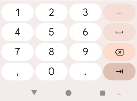
<input type=”number”> is used to get numeric values from users. It only accepts numbers and you can also set conditions for the number range. The important reason to use the type=”number” is to show a numeric keyboard for mobile and tablet users. In the example below, users can only enter a number between 2 to 10. The step attribute determines how much the number increases or decreases when using the arrows or entering values.
<label for="number">Quantity</label>
<input type="number" id="quantity" name="quantity" autocomplete="number" min="2" max="10" step="2" placeholder="2">HTML example of a number input
6. Phone number input
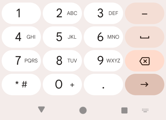
<input type=”tel”> is another form input type that is used for getting phone numbers. The functionality of this input type is the same as text input. However, by using this type=”tel” the specific telephone keyboard will be shown. In addition, by using HTML5 patterns, it is possible to define phone number patterns. In the example below, phone numbers should be entered following the Format: 123-45-678.
<label for="phone">Phone number</label>
<input type="tel" id="phone" name="phone" placeholder="123-45-678" pattern="[0-9]{3}-[0-9]-[0-9]{3}">
Pattern break down:
[0-9]: numbers should be between 0 to 9.
{2} or {3}: 2 or 3 numbers should be entered.
HTML example of a tel input
7. Time input
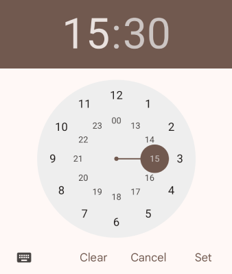
<input type=”time”> is used to select a specific time. Based on the browser, a time picker will be shown to users for picking time. In the time picker, it is possible to select hour and minute in AM or PM.
<label for="appointment">Select a time</label>
<input type="time" id="appointment" name="appointment">HTML example of a time input
The <input type=”time”> is NOT used for time zone.
8. Date input
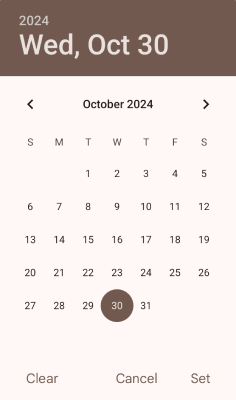
<input type=”date”> is another input type that is used for selecting a date in a form. By using this input type, a date picker is shown to users based on their browsers, and they are able to pick a specific date including year, month, and day.
<label for="birthdate">Birth date</label>
<input type="birthdate" id="birthdate" name="birthdate">HTML example of a date input
9. Date and time input
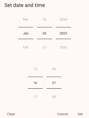
<input type=”datetime-local”> is used to have date and time in a box simultaneously. By using this input type, users are able to pick a date (year, month, and day) and time (hour and minute) in AM or PM.
<label for="appointment">Appointment (date and time)</label>
<input type="datetime-local" id="appointment" name="appointment">HTML example of a datetime-local input
10. Week input
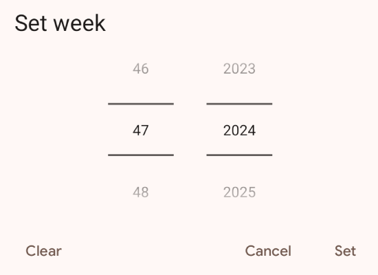
<input type=”week”> is used to have weeks in a date picker. In this picker, year, month, and week can be selected.
<label for="week">Select a week</label>
<input type="week" id="week" name="week">HTML example of a week input
11. Month input
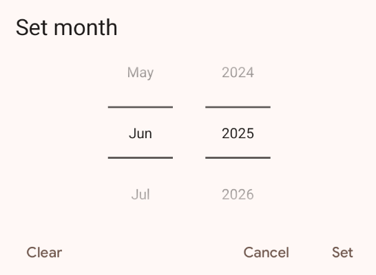
<input type=”month”> is used to only select year and month in a date picker.
<label for="birthdaymonth">Birthday (month and year)</label>
<input type="month" id="birthdaymonth" name="birthdaymonth">HTML example of a month input
12. Range input
<input type=”range”> is used for inputs that their exact value is not important or do not have an exact value. The range input is a control that has minimum and maximum values that are 0 and 100 by default and they are defined with min and max attributes. These values can be changed to any other values and the steps of value changes can be set using the set attribute as well.
<label for="vol">Volume (between 0 and 50)</label>
<input type="range" id="vol" name="vol" min="0" max="50" step="5" value=”40”>
In the example above, the default value is 40 and the step attribute is 5, which means that by moving the range controller forward or backward, the value will increase or decrease 5 times.
HTML example of a range input
13. C13- Color input
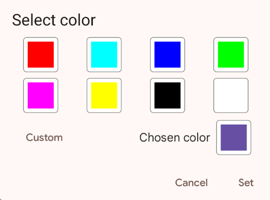
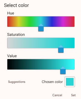
<input type=”color”> in a form creates a color picker with which users can select a color from the color palette or enter a color code in RGB, HEX, and HSL.
<label for="color">Select a color</label>
<input type="color" id="color" name="color" value="#6a5294">HTML example of a color input
Form accessibility best practices
If you are going to create a form on your website, or you have already created one, it is important to make them accessible for all people as forms can be complex and not everyone, including individuals with disabilities like cognitive disabilities and limited dexterity or people using speech input or screen readers, is able to fill it easily. Here are some best practices with which you can improve your forms for all groups of people.
1. Labeling inputs
Labels are used to describe what the form field is about. The <label> has a for attribute that defines which label that belongs to which input.
<label for="firstname">First name</label>
<input type="text" name="firstname" id="firstname">
The for attribute should be exactly the same as the input id.
Another approach for identifying form fields is to use the aria-label attribute. It can describe the form field, but it should only be used in cases where the form label is clear from the nearby content. This attribute is supported by assistive devices and screen readers, but unlike the title attribute, its information is not visible to visual users.
<input type="text" name="search" aria-label="Search">
<button type="submit">Search</button>
The aria-labelledby attribute is another way of identifying fields of a form, and same as aria-label, it is supported by screen readers and assistive devices. The difference between aria-labelledby and aria-label is that the value of the aria-labelledby is exactly the same as the field ID.
<input type="text" name="search" aria-labelledby="searchbutton">
<button id="searchbutton" type="submit">Search</button>
Using the title attribute also helps to identify a form, but it is not much reliable and it may not be supported by screen readers or assistive devices as a label replacement. The value of the title attribute is visible to the visual users and it is shown as a tooltip after hovering on the field.
<input title="Search" type="text" name="search">
<button type="submit">Search</button>
2. Providing form fields’ instructions
It is also important to provide data format instructions within the <label> to help users better understand how to enter their data.
<label for="expire">Expiration date (MM/YYYY)</label>
<input type="date" name="expire" id="expire">
In the example above, in addition to providing information about the form field, the acceptable expiration date format is also specified to help users enter the date in the correct form.
Like <label>, you can also use aria-labelledby to provide form field instruction to the user. The difference is that the form field instruction is outside of the label.
<label id="expirationlabel" for="expire">Expiration date</label>
<span>
	<input type="date" name="expire" id="expire" aria-labelledby="expirationlabel expirationdescription">
	<span id="expirationdescription">MM/YYYY</span>
</span>
Another method for adding an instruction to a form field is to use aria-describedby. The difference between aria-describedby and aria-labelledby is that aria-describedby is used for adding a description to a form field, while aria-labelledby is used to add a name to a form field. For adding an instruction to a field using aria-describedby, you need to add it after the label and other information provided to users.
<label id="expirationlabel" for="expire">Expiration date</label>
<span>
	<input type="date" name="expire" id="expire" aria-labelledby="expirationlabel" aria-describedby="expirationdescription">
	<span id="expirationdescription">MM/YYYY</span>
</span>
Using placeholder is another approach for providing form field instruction like data format inside the field. A placeholder is often shown with a low contrast color and by clicking on the field, it disappears.
<label for="email">Email</label>
<input type="email" name="email" id="email" placeholder="[email protected]">
Although the placeholder provides instructional information within a field, it is not a replacement for the label as supportive (assistive) devices do not treat it as labels.
Form inputs’ best practices
By following the instructions below, you can create forms that are organized and easy to fill and understand:
1. Grouping form elements
Grouping related form elements makes a form more understandable for all users. It is considerably helpful in big forms with too many elements where focusing and managing the form fields are hard.
The <fieldset> element creates a container for related fields to be in one place. The <legend> element adds a heading to the container which specifies what the container is about.
<fieldset>
<legend>I want to receive</legend>
	<div>
		<input type="checkbox" name="newsletter" id="check_1">
    <label for="check_1">The weekly newsletter</label>
	</div>
	<div>
		<input type="checkbox" name="newsletter" id="check_2">
    <label for="check_2">Offers from the company</label>
	</div>
<div>
		<input type="checkbox" name="newsletter" id="check_3">
    <label for="check_3">Offers from associated companies</label>
	</div>
</fieldset>HTML example of <fieldset> element
2. Validating form inputs
Validating inputs entered by users is another important note to consider to prevent any mistakes made by users when entering data.
Validating required inputs
For required input, it should be clearly noted in the form label. In addition, the required attribute in the form field can also indicate that the input is necessary to be entered. Almost all the popular browsers support the required attribute and if the required input is not entered, a warning message which is generated by the browser will be shown to the user.
Regarding form field <label>, by specifying the field is required, you can help users with old browsers that do not support the required attribute or do not use supportive devices, notice that the form field is required.
The aria-required=”true” is a complementary attribute that ensures assistive devices with old browsers, that do not support the required attribute, are informed about the required input.
<label for="name">Name (required)</label>
<input type="text" name="name" id="name" required aria-required="true">
Validating patterned input fields
Pattern is another form element attribute that specifies how an input should be entered. This attribute is used by adding HTML5 patterns using RegEx rules for special inputs that need to follow a rule(s) when entered. For example, the phone number format is not the same in all the countries. In Canada, one the most common phone number formats is AAA-BBB-CCCC. This is while the common telephone number format in France is AA BB CC DD EE.
Or as another example, you can use a pattern like the below for the URL form element to make sure the entered input is a URL:
<input type="url" id="url" name="url" pattern="https?:\/\/(www\.)?[-a-zA-Z0-9@:%._\+~#=]{2,256}\.[a-z]{2,6}\b([-a-zA-Z0-9@:%_\+.~#?&//=]*)" placeholder="https://example.com" required autocomplete="off" aria-describedby="url-help url-error">User-side data validation can be helpful as users can see the error real time. However, this data validation can be bypassed or they (including HTML5 rules and custom scripts) may not be supported by all browsers. Therefore, it is important to validate data server-side as well.
User notification in form elements
Another important point to consider is to provide notifications after each submission to notify whether the form was sent successfully or there is an error(s) in submitting. It is also recommended to notify users about the data they have entered using the approaches below:
- After submitting form: The first method is to show error or valid messages after submitting the form next to each form element. This way, users will know in which form field the problem exists, so they can easily correct it.
- At the time of filling each field: In this method, users will get notified while they are filling out the form. For instance, when a user enters an email address, it is checked whether the necessary elements of an email like @ exist. This real time input validation can be done in three methods:
- Backend: It can be done server-side by using AJAX and sending the data to the server while a user fills out a field.
- Front-end (browser): Using HTML5 pattern to validate the entered data while a user fills out a field.
- A combination of method 1 and 2: It means the input validation is checked both backend and front-end at the time of filling each field out and after submitting the form. This method is highly recommended because it not only improves the user experience but also enhances input validation safety through backend validation, which prevents validation manipulation that may happen on the frontend.
- At the time of changing the field’s focus: In some cases, it is not that helpful to show a validation message at the time of writing, as it is still incomplete, and only error messages are shown. In this situation, it is better to show a validation message when the focus of the form element is changed by clicking on the next field or using the Tab button to go to the next field.
Conclusion
In conclusion, HTML5 input types help developers create interactive and user-friendly forms. By offering a wide range of input types such as email, date, color, and range, HTML5 not only simplifies validation but also enhances the user experience with device-friendly inputs. Additionally, these features enable developers to create accessible and responsive forms that work for different user needs.
📚Resources: